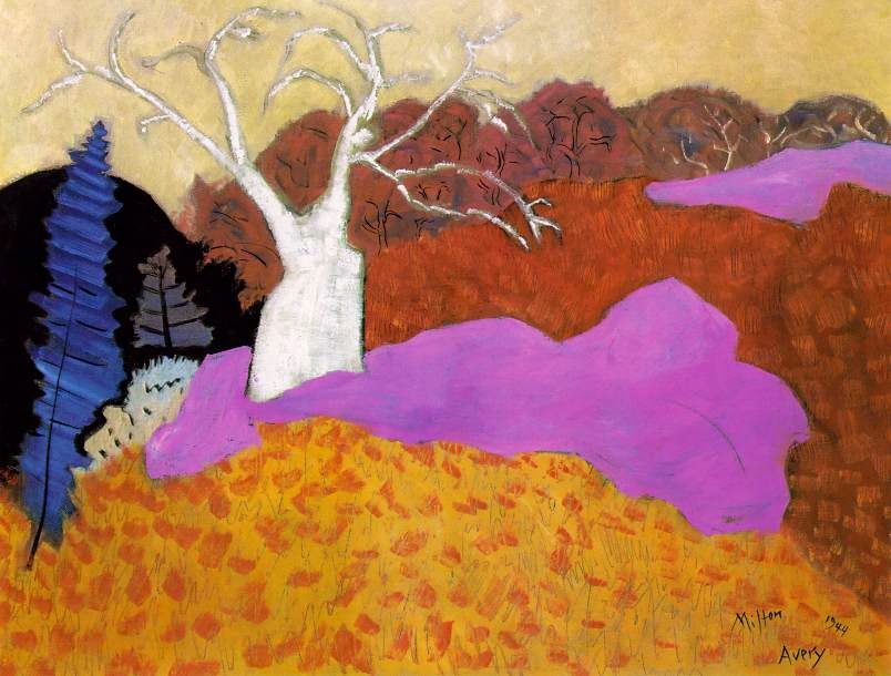
Once again, the editorial team (or some of the editorial team!) from Art Bead Scene have decided to take on the monthly challenge. Here’s the challenge image.
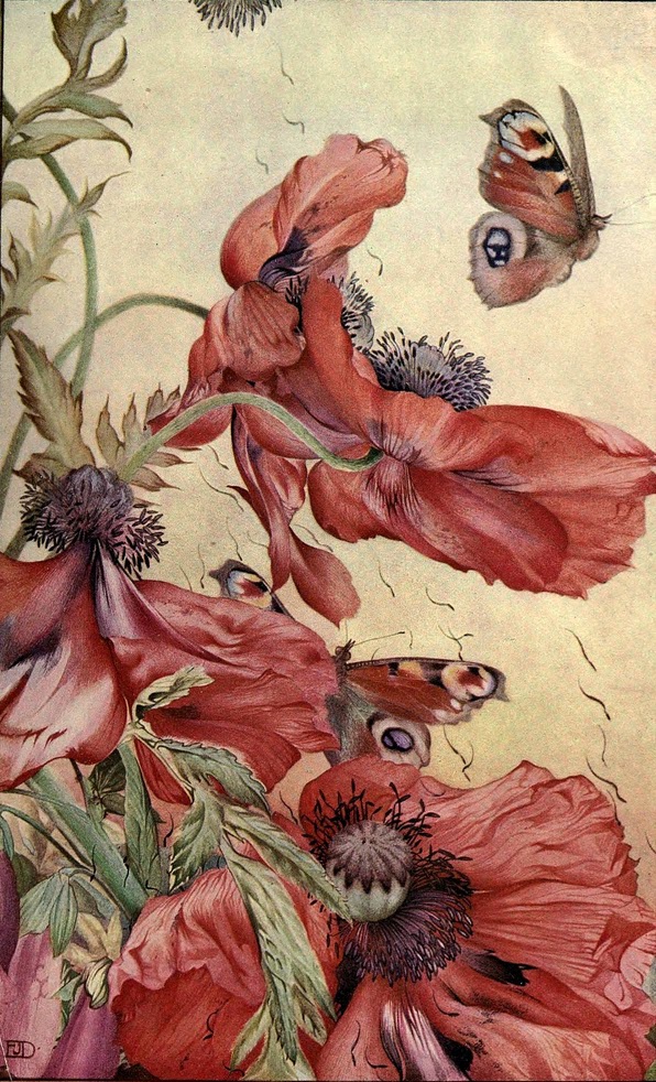
Amapolas, 1913
Illustration published in News of Spring and Other Nature Studies
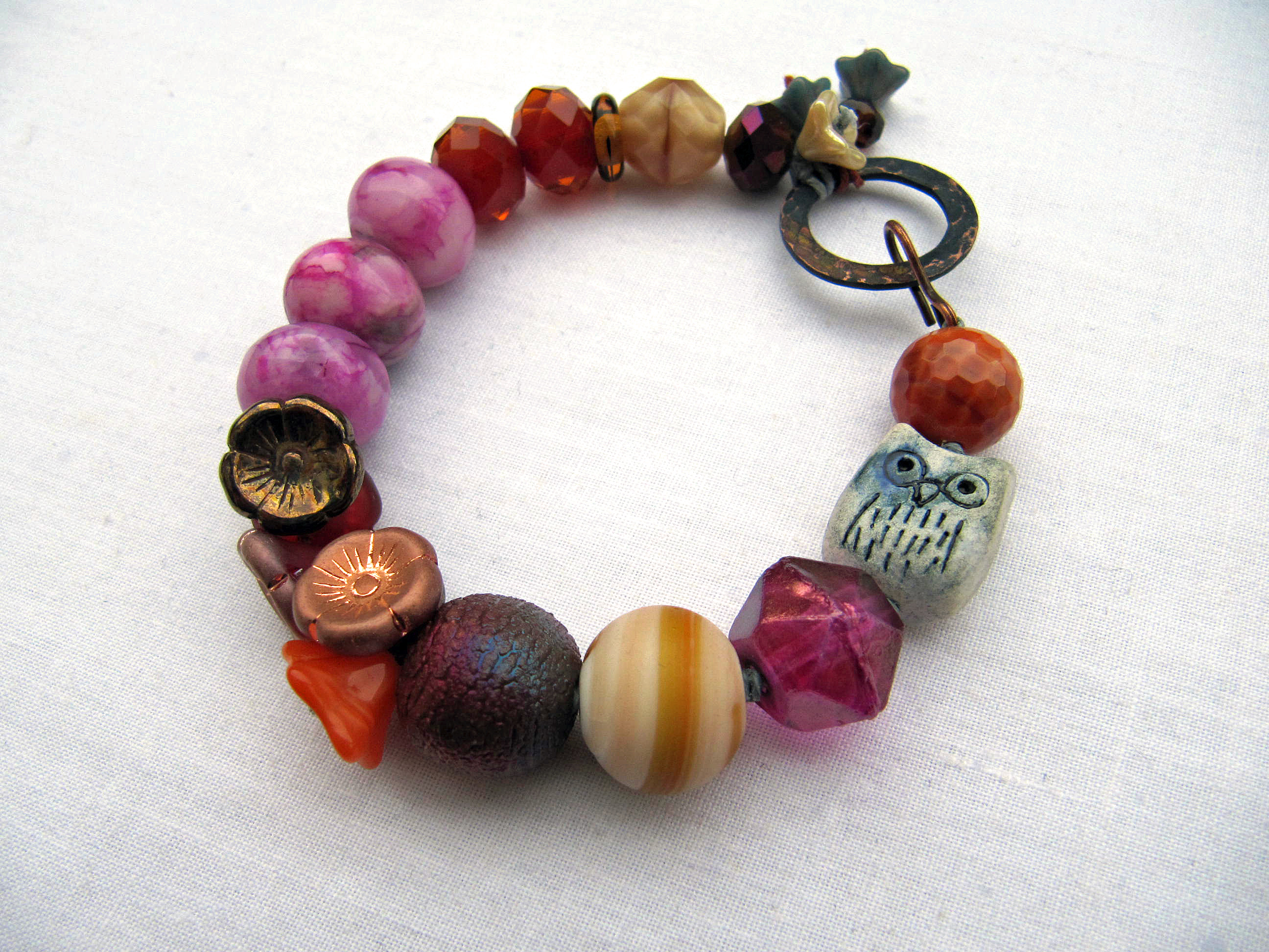
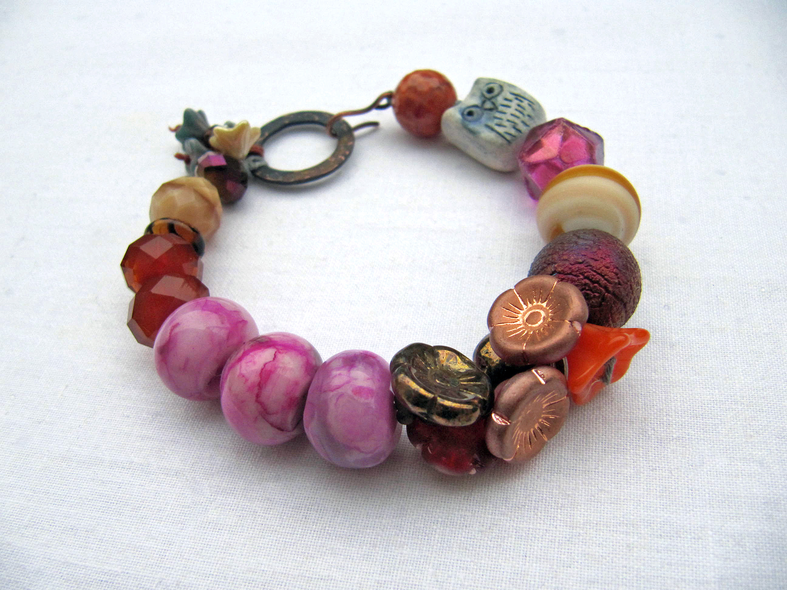
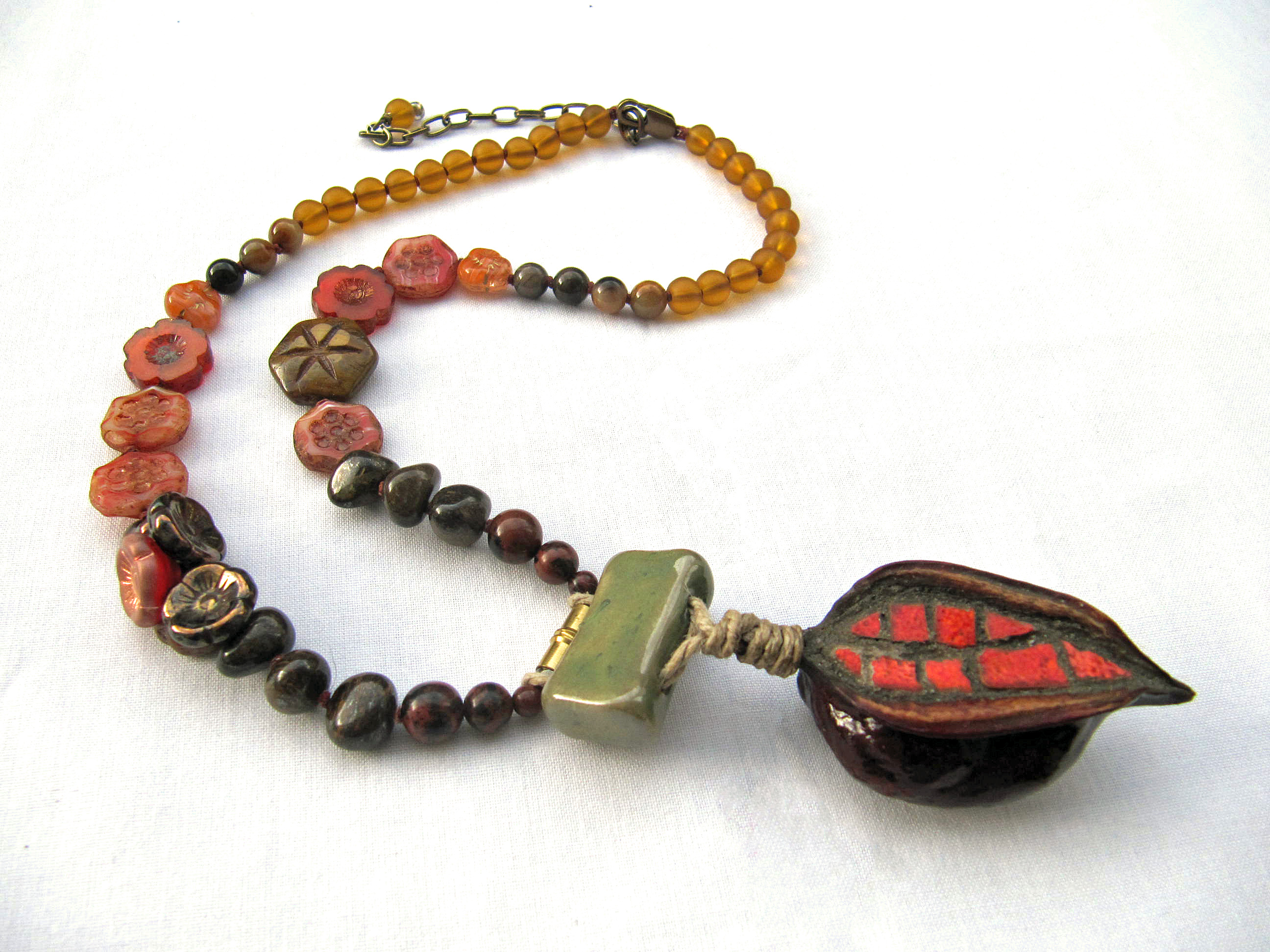
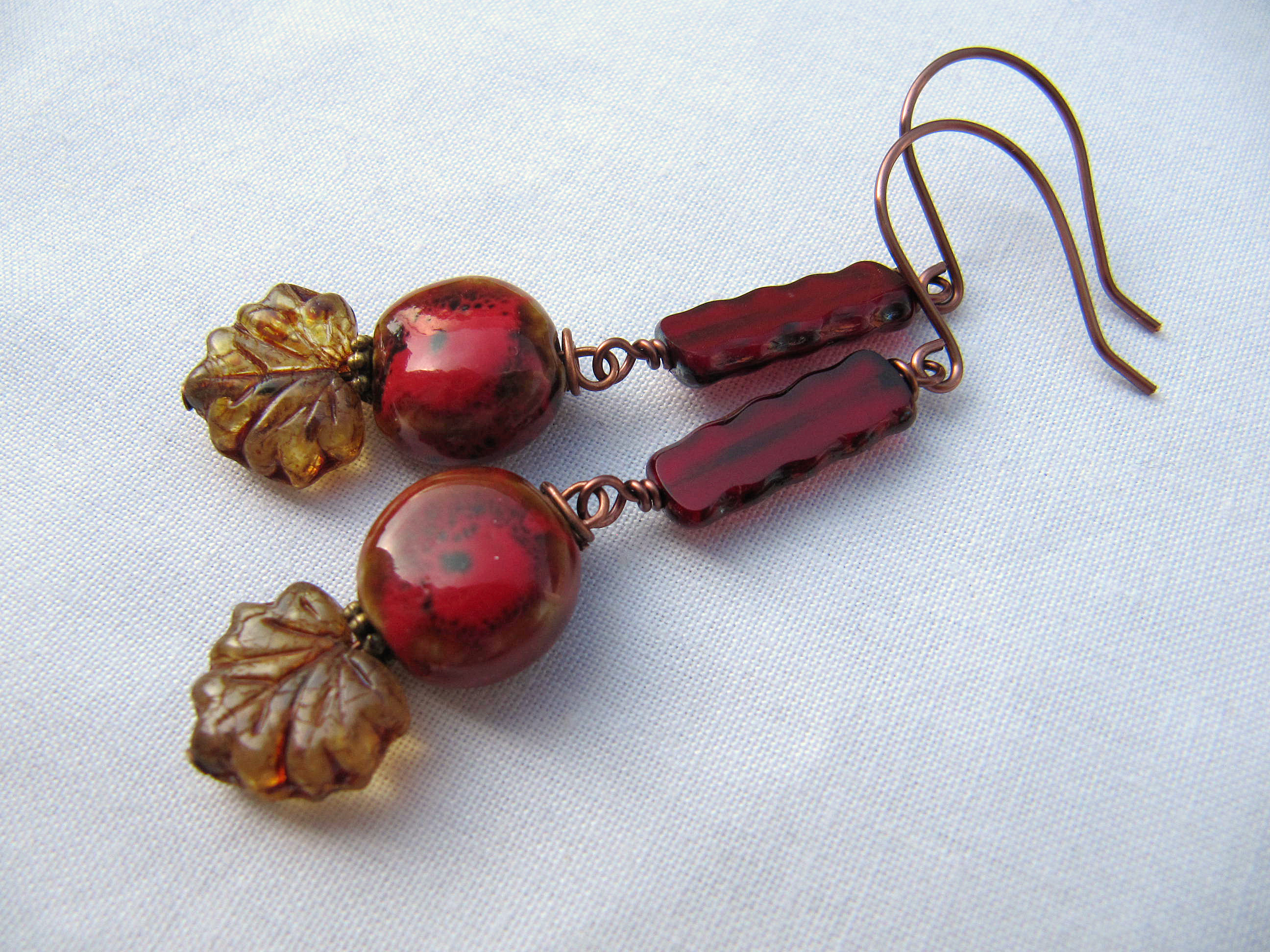
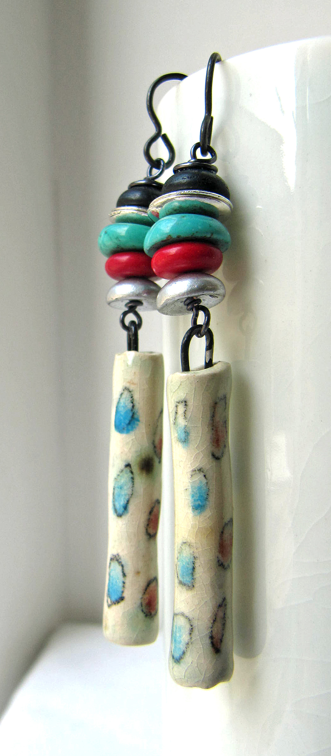
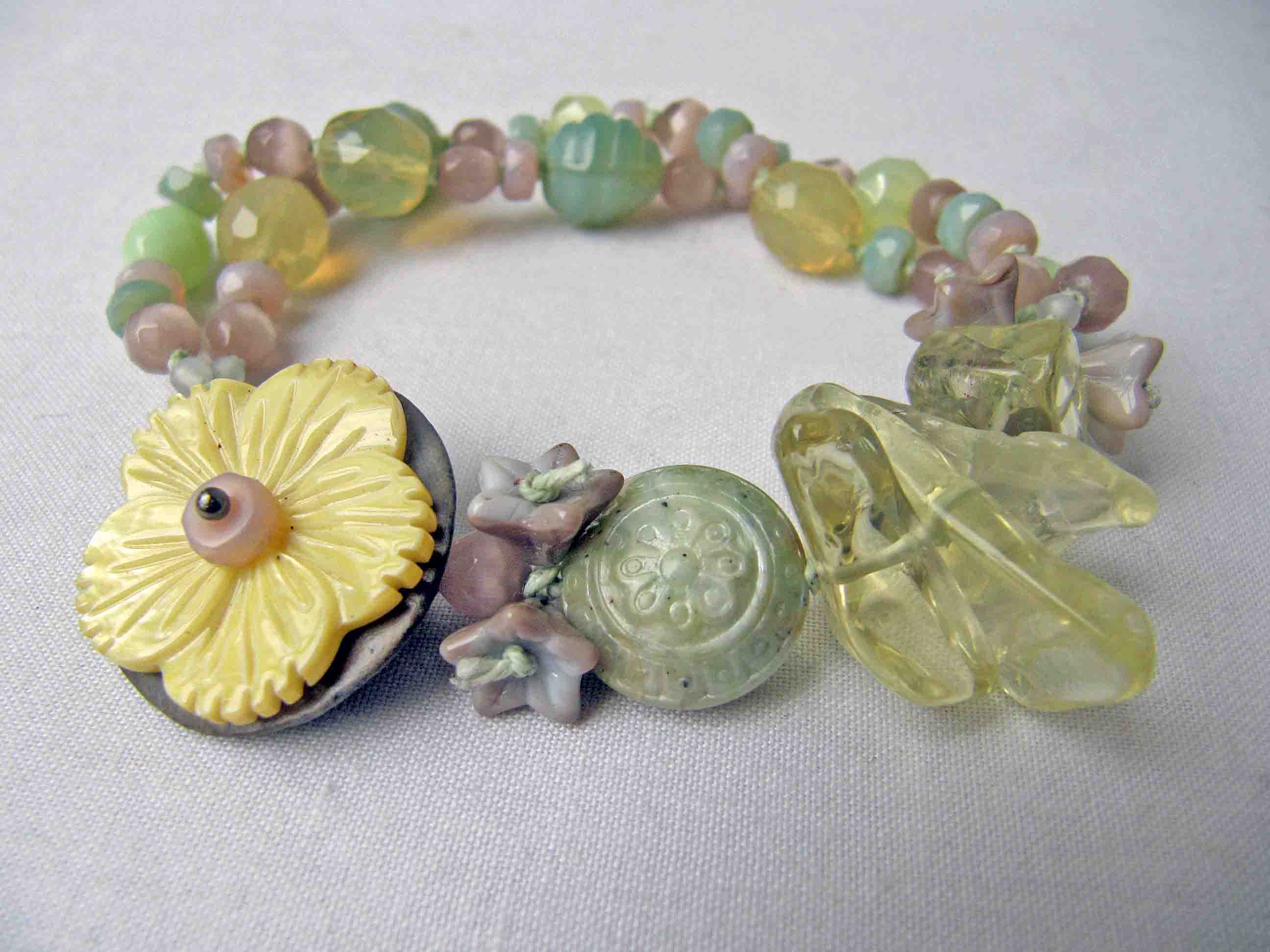
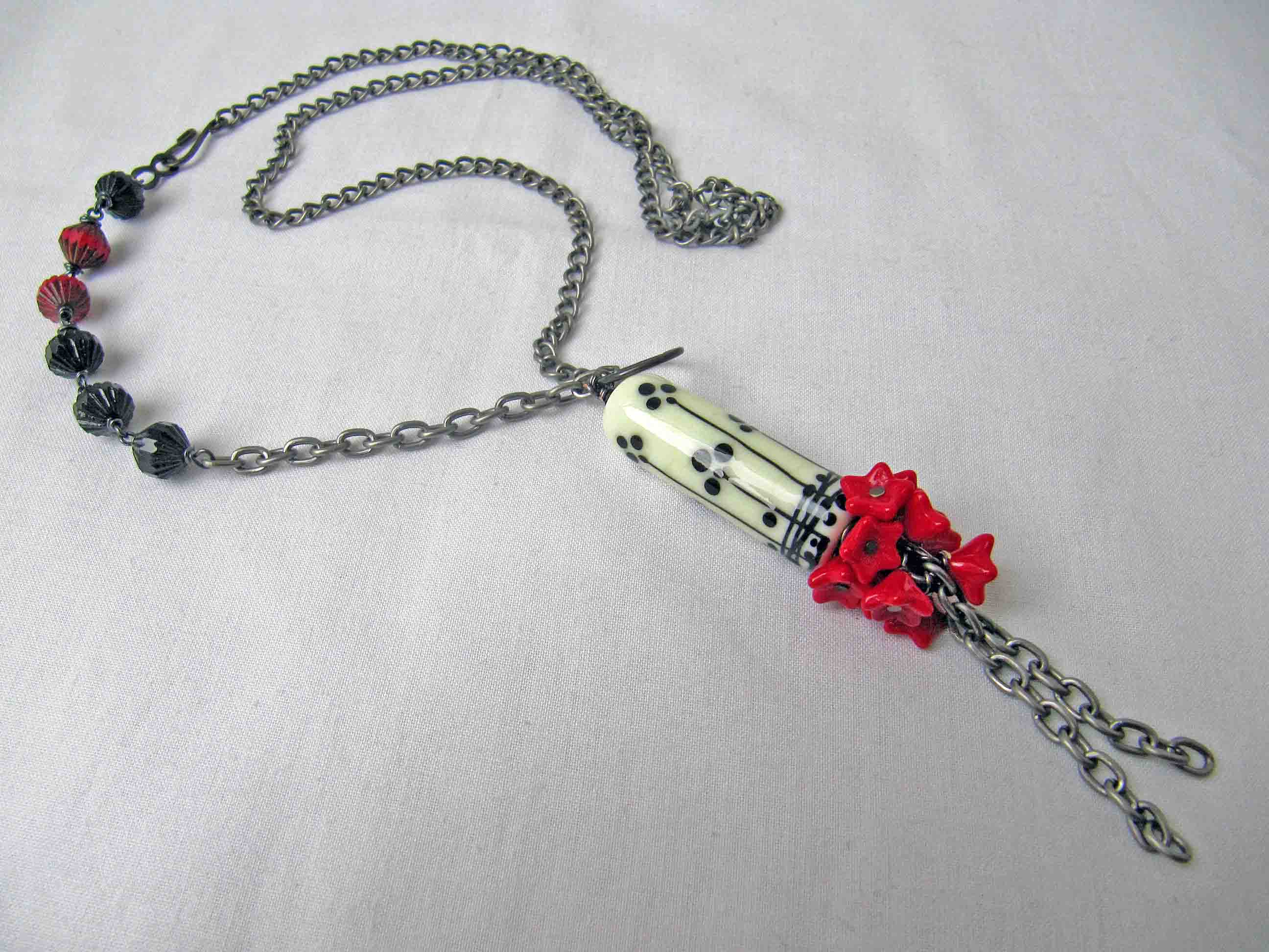
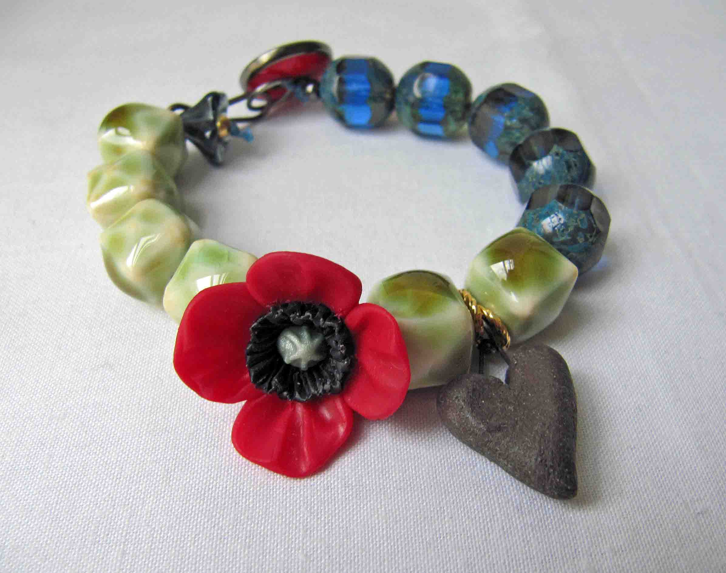
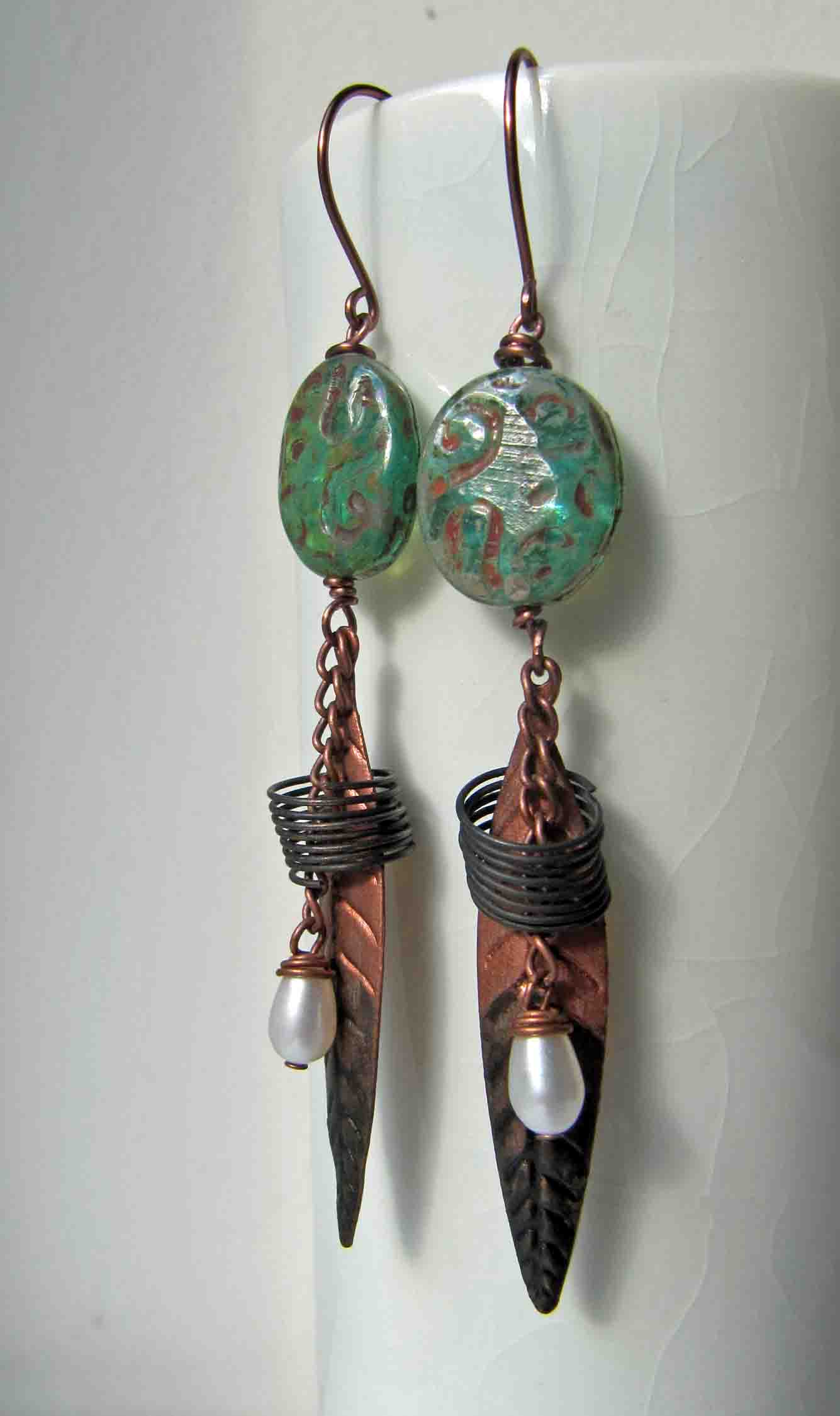
I have to admit that this one had me a little stumped. It’s been a hectic (for me) week and I left my makes till the last minute. So, yesterday saw me scratching around, desperately trying to put something together. For some reason, I was quite set on making earrings. I’m not sure what my problem was. There are a couple of obvious tropes - poppies and butterflies - but the things that appealed to me most in this image were the windswept-ness (nope, not a word) and the slightly faded, washed out colours. The poppies and butterflies I had in my stash were too crisp and stylised to work, so I tried focusing on the colours. As ever, Brandi’s palette post was a great help. I tried pulling together various elements using the different shades Brandi picked out, but I was still struggling. Finally, I remembered some suede poppies that I got some time ago. In the same box I found some lovely wooden oval shaped buttons, that matched the grey-brown in the palette. I stacked up some bead caps to form the poppy centres and - lo! - I had the makings of a pair of earrings. But I’d forgotten something - guess what? Art beads, of course! I tried sitting a number of rondelles on the top of the buttons but they were all too big and too busy. Eventually, I reached for a pair of lampwork spacers that I’ve had for ages. They were just right: and a beautiful shade of deep olive green. Unfortunately, I’ve had them so long, I have forgotten where they came from….. Sorry!

Perhaps art beads should be playing a more prominent role but, really, after all my troubles I decided they’d have to do.

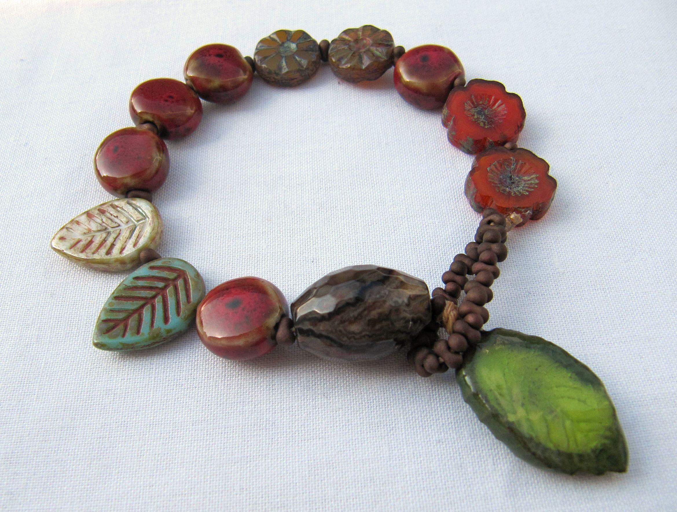
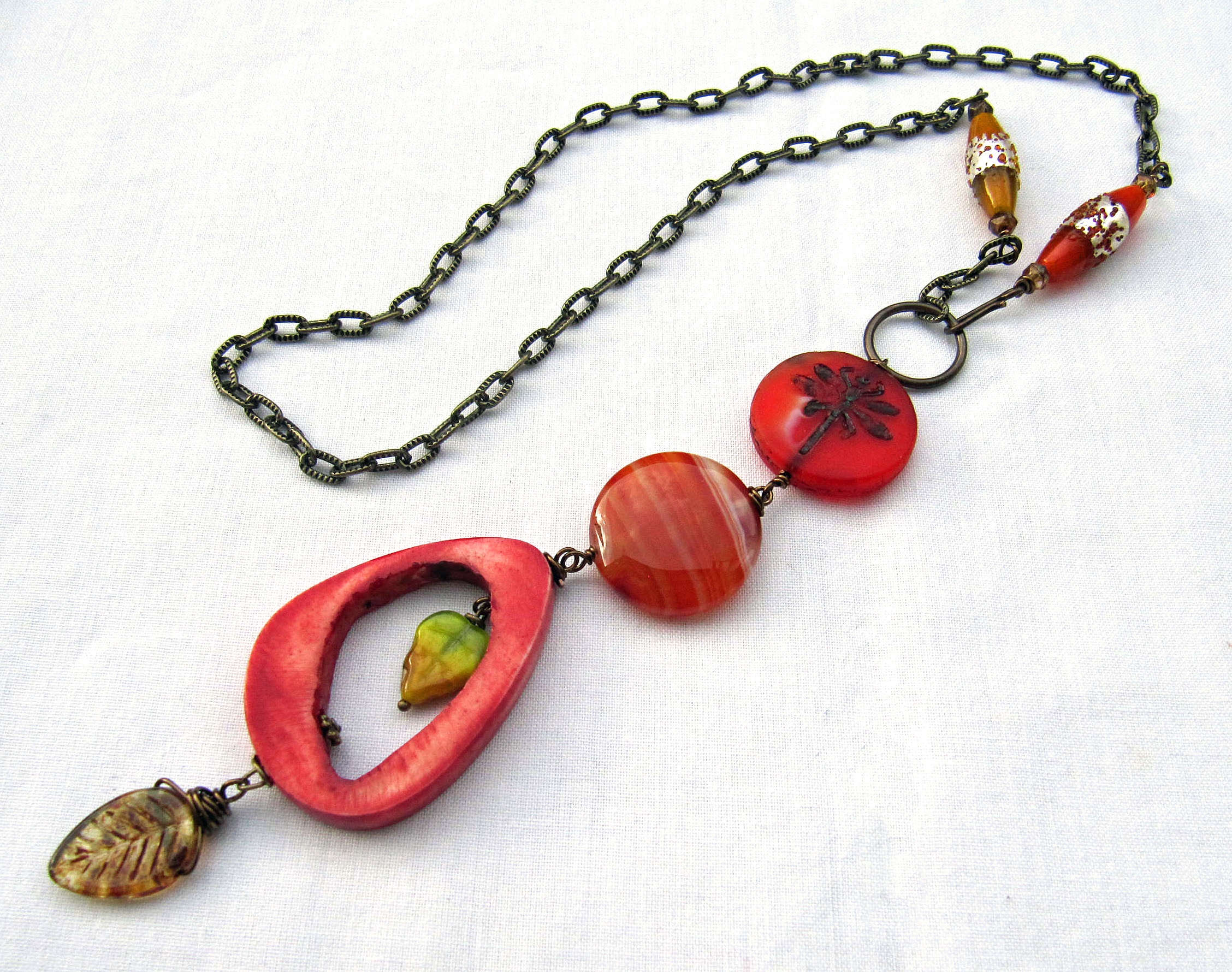
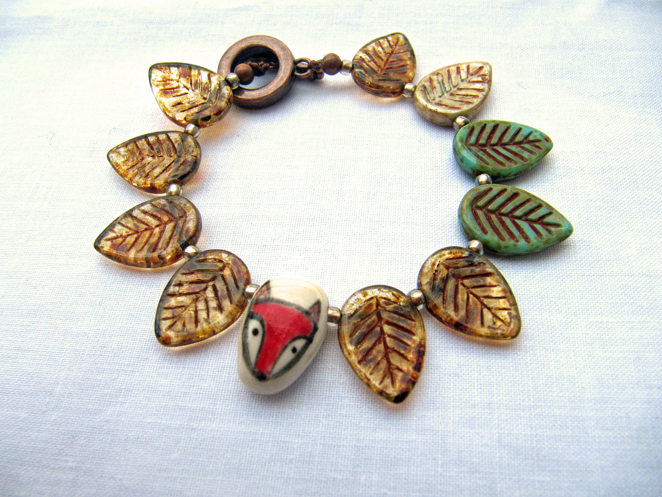
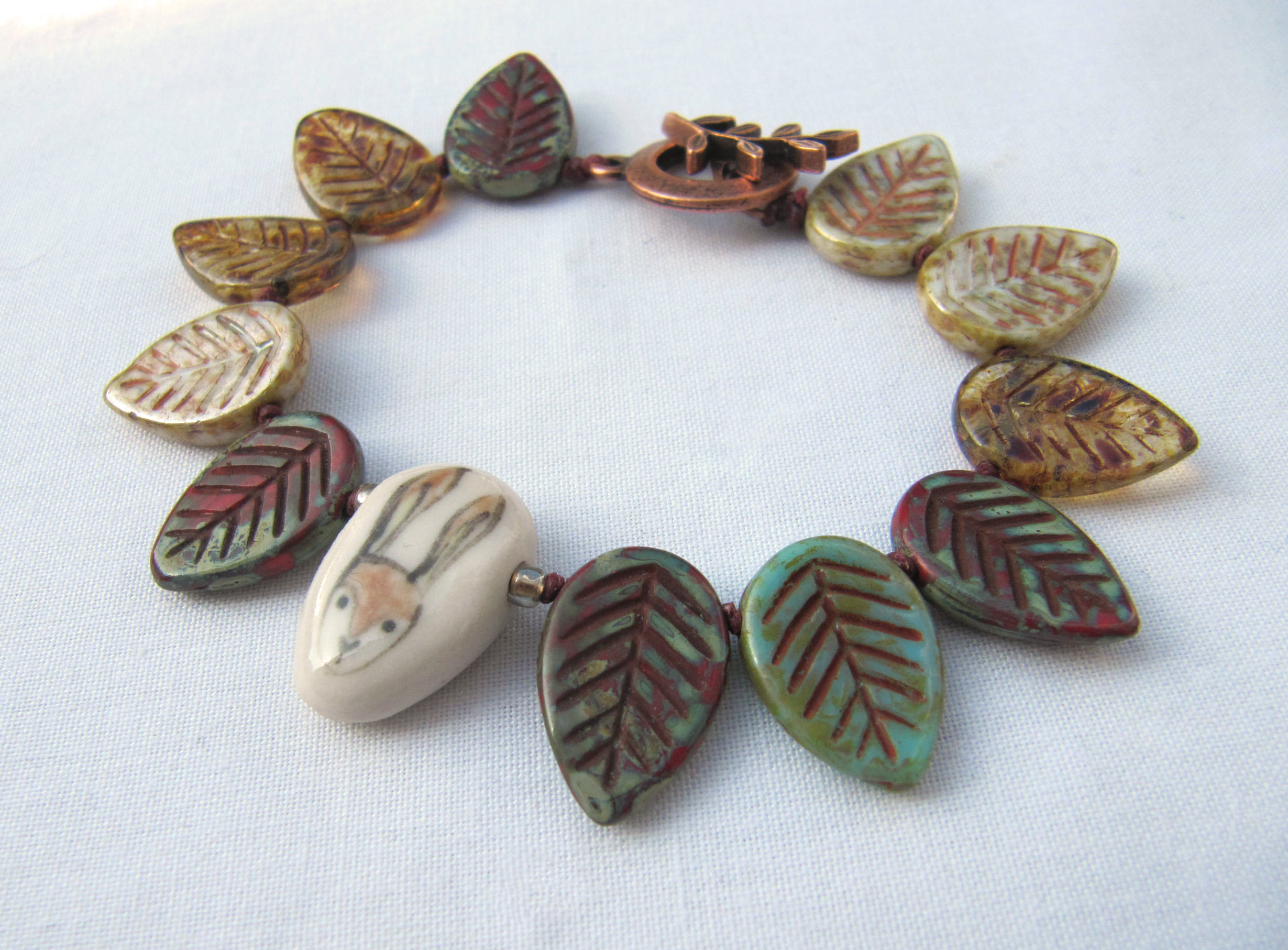
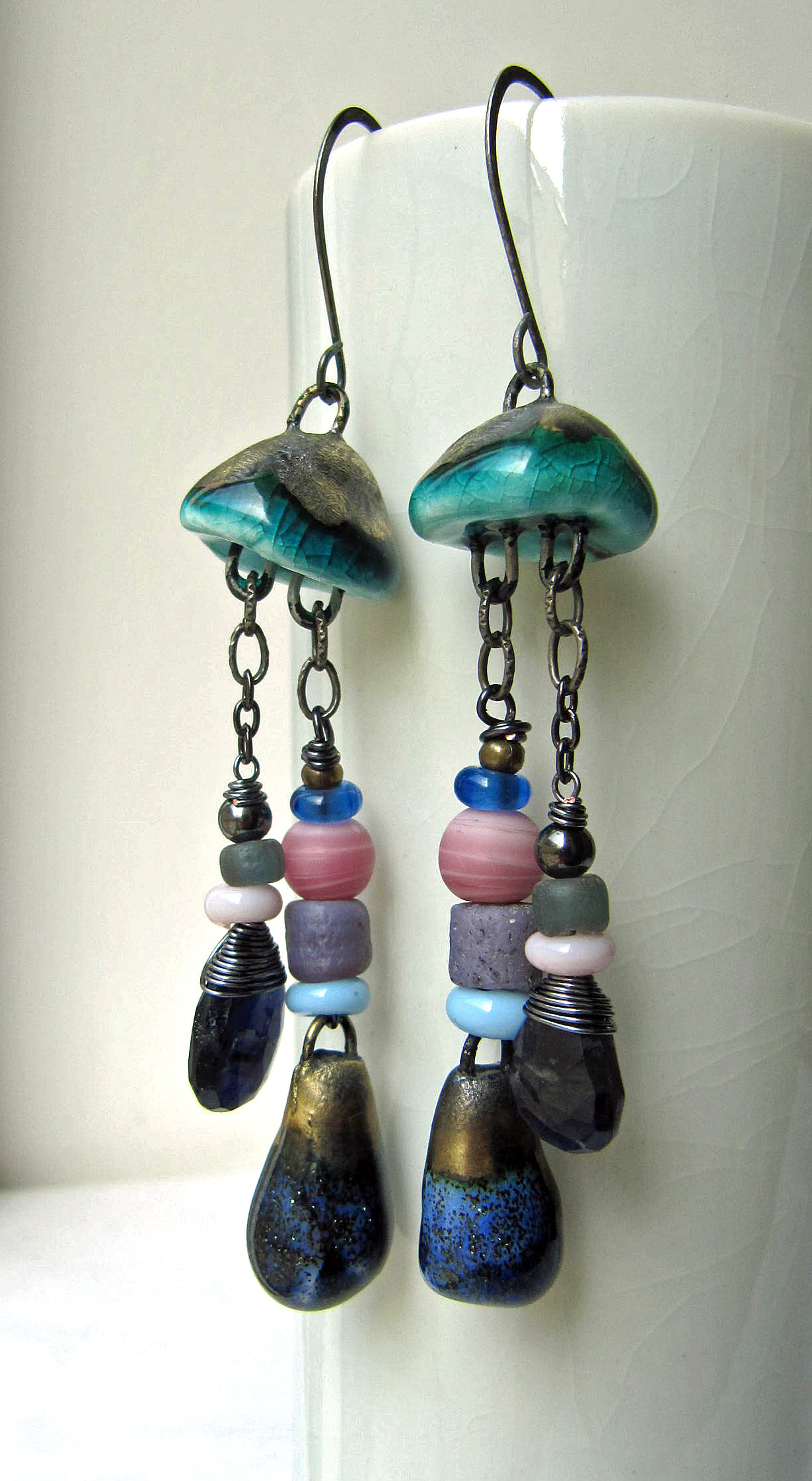
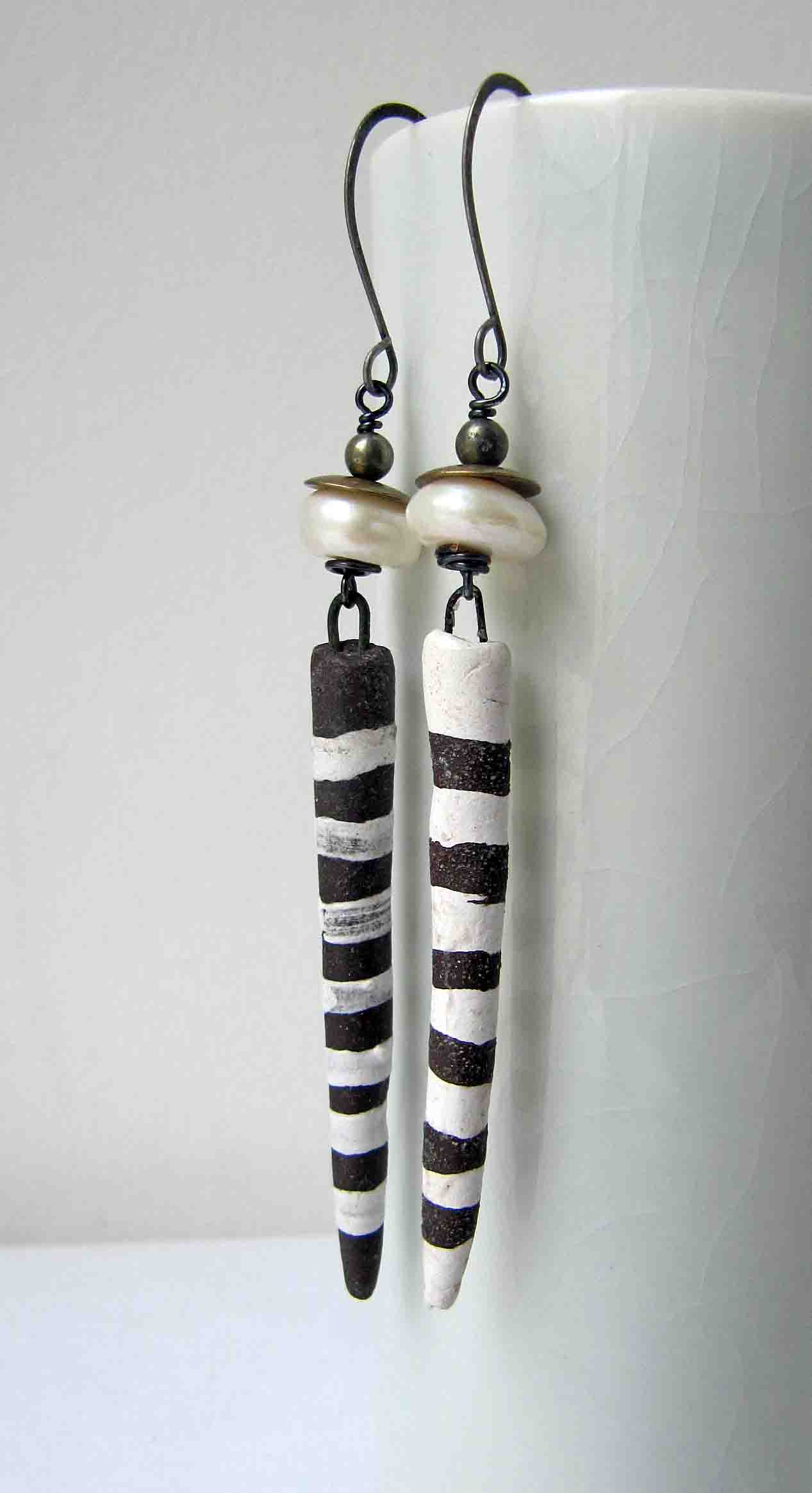
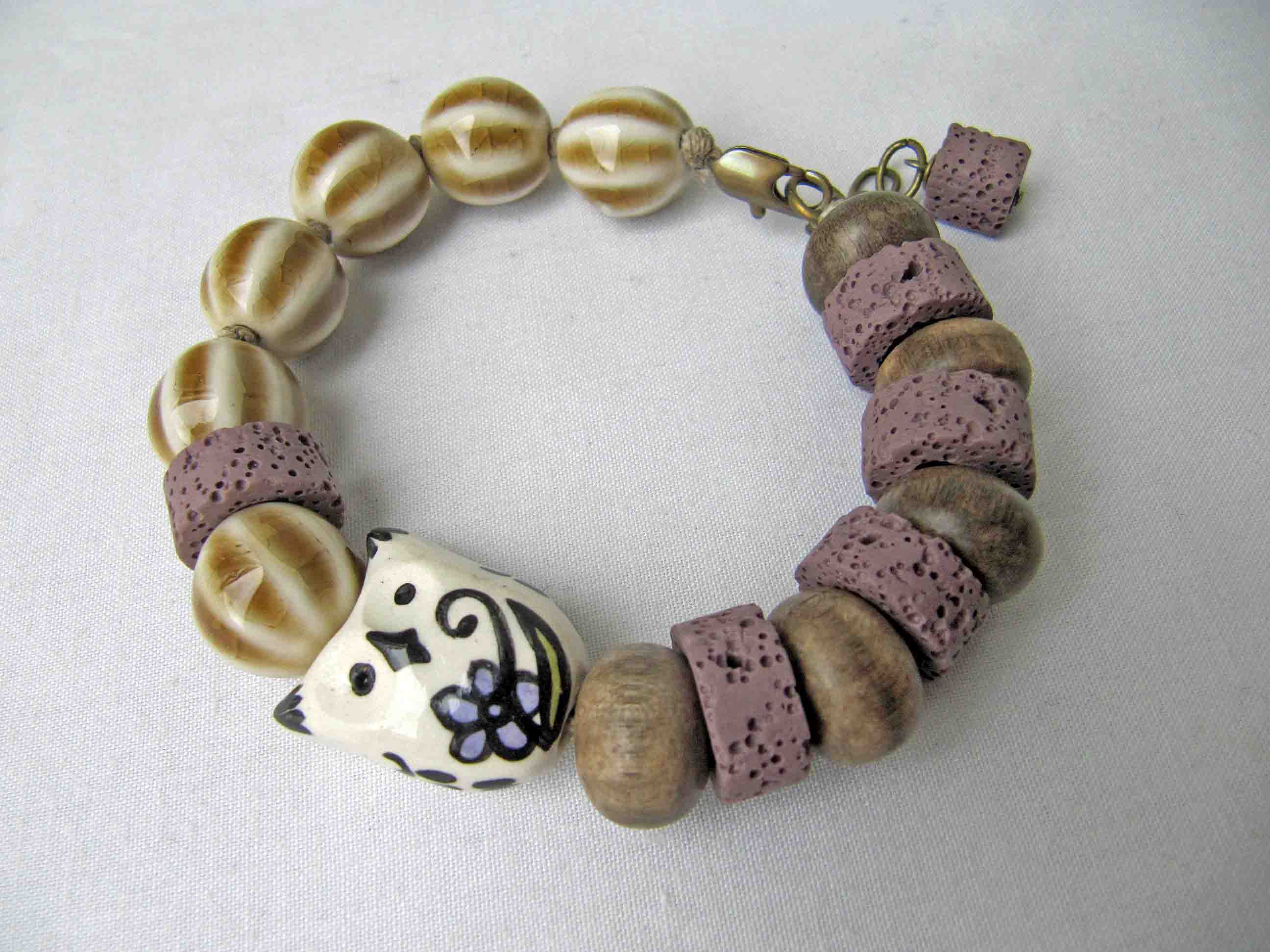
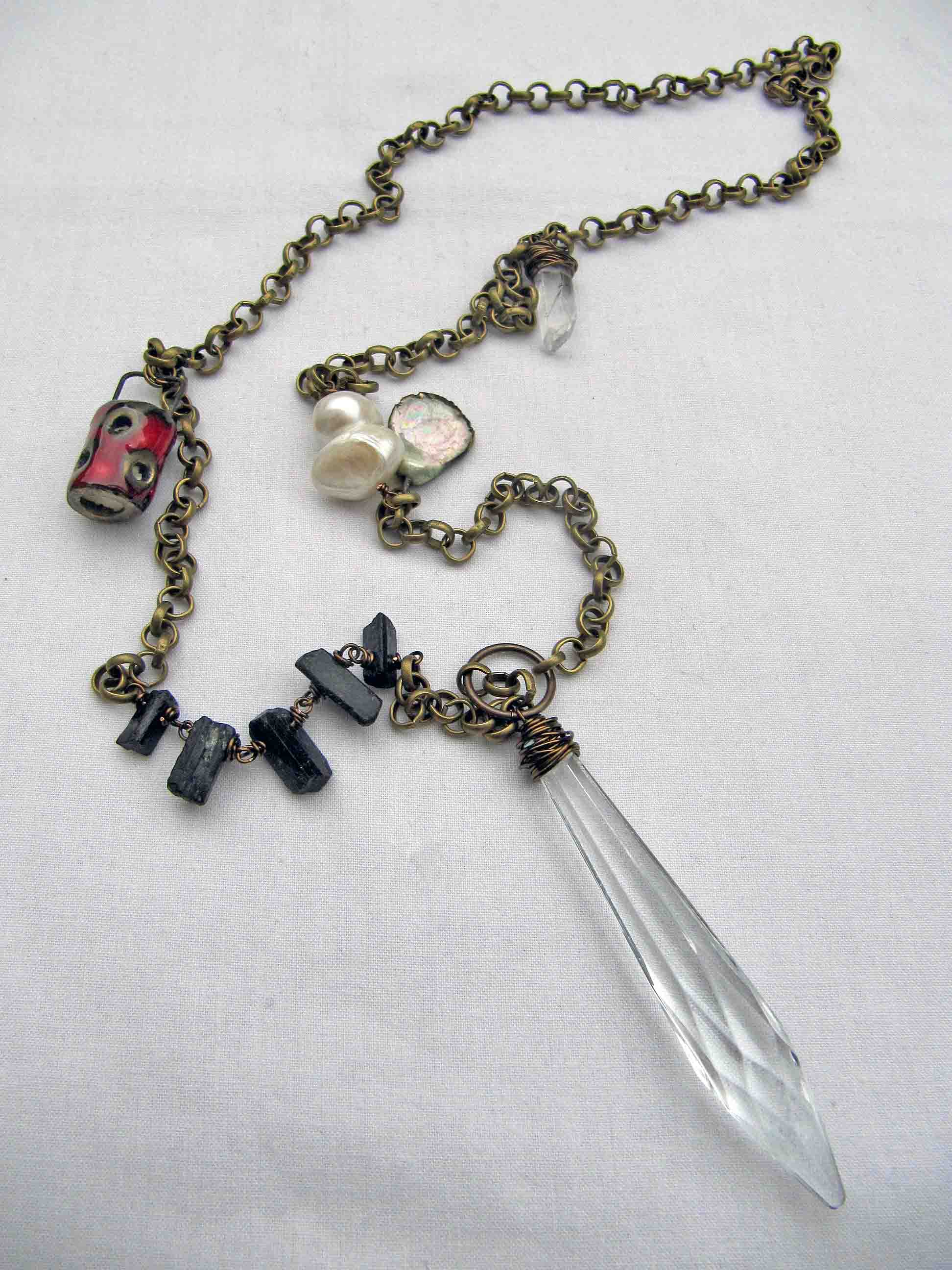
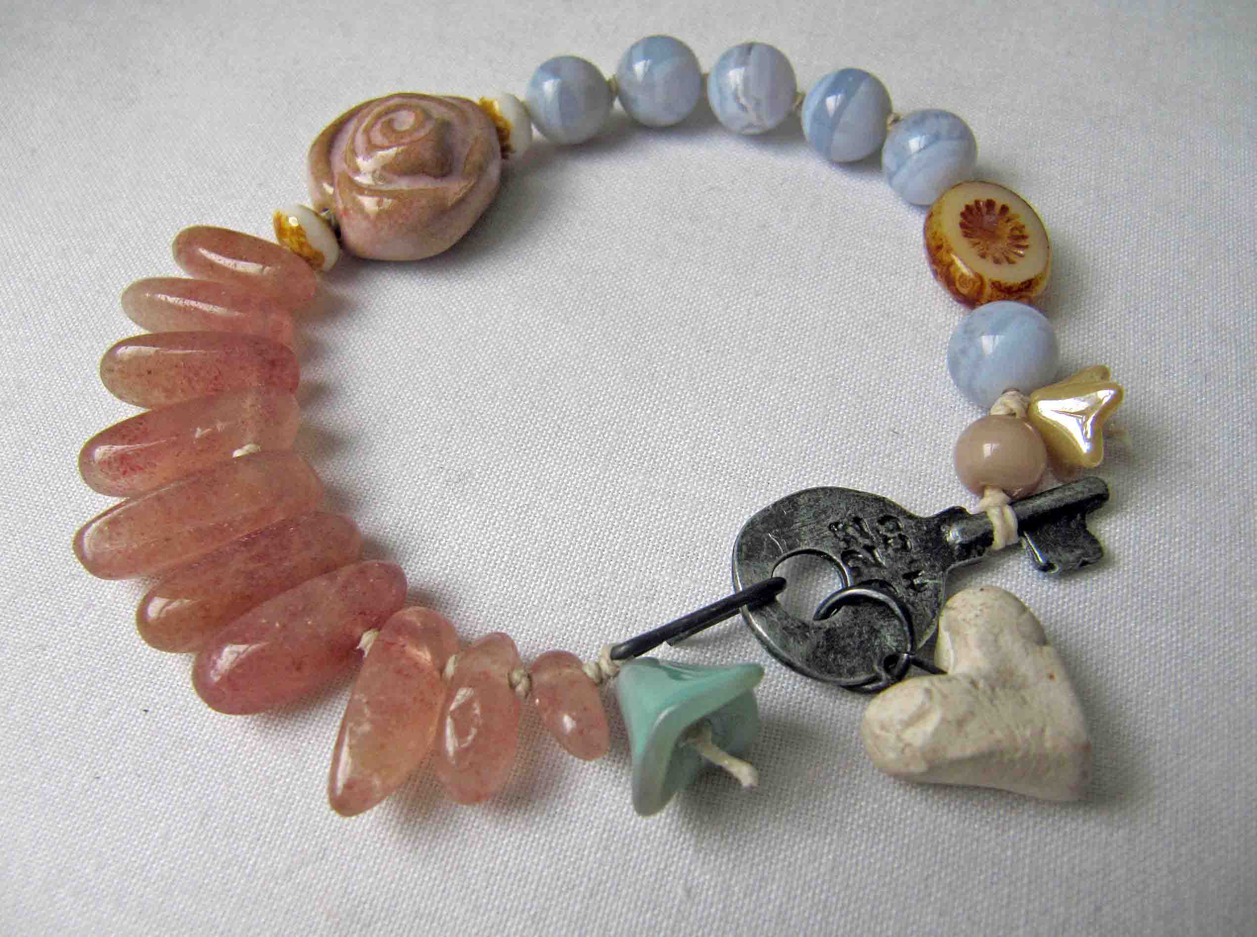
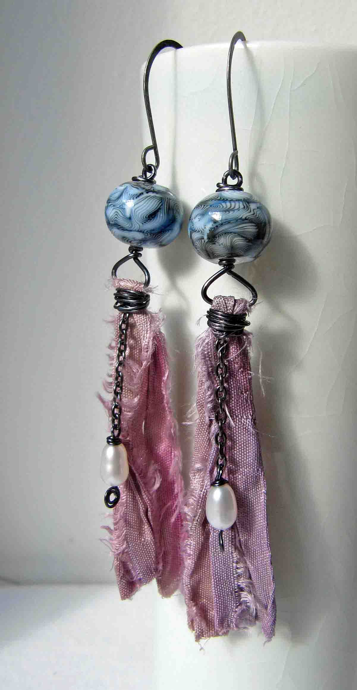
To compensate, I managed to come up with another pair. I decided to swerve the various reds and worked with some of the more muted, earthy shades, the greens and browns. I’d already been playing around with a pair of bronzy-brown Scorched Earth leaves. I teamed them with some of my own ceramic roses.

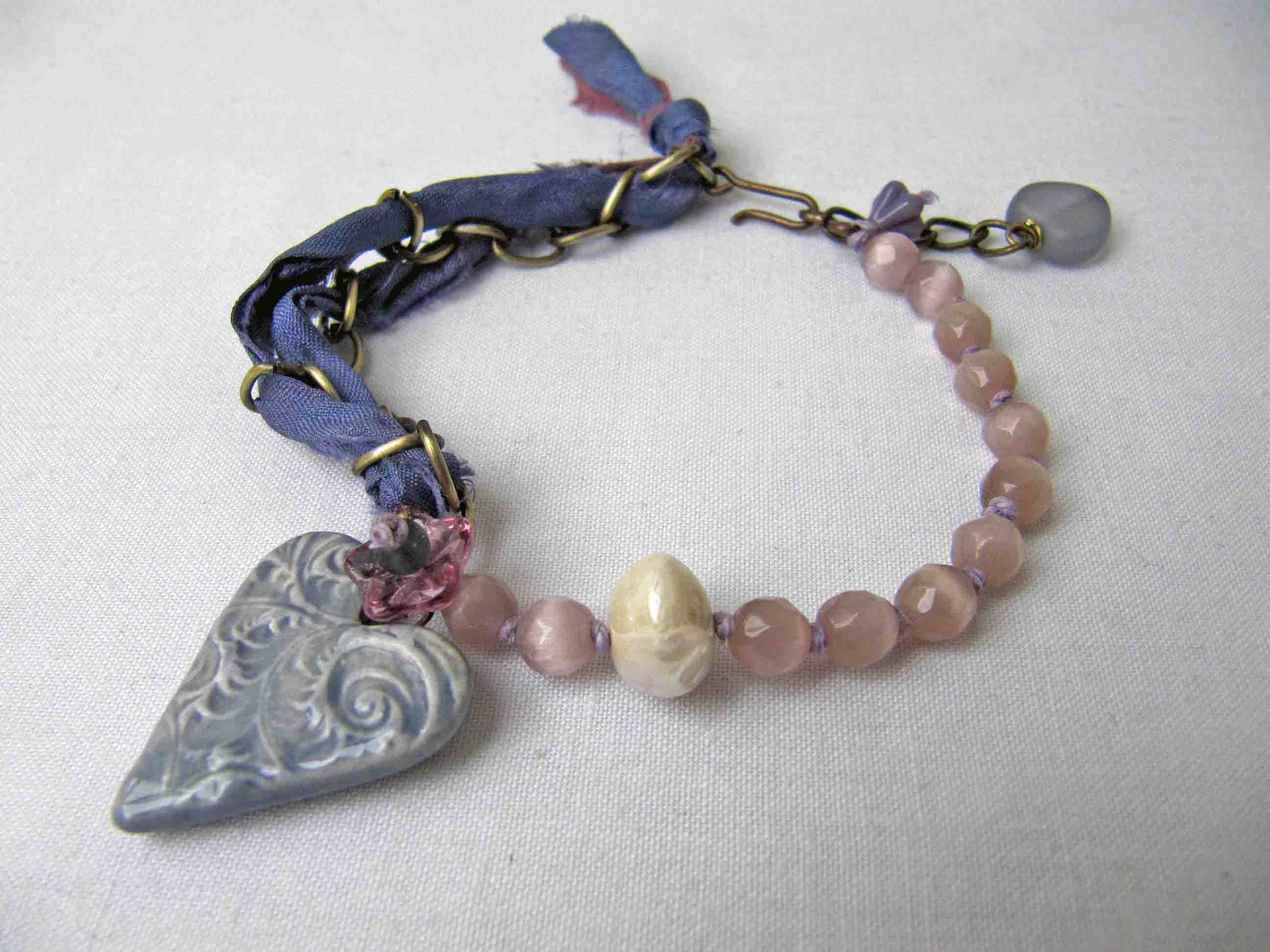
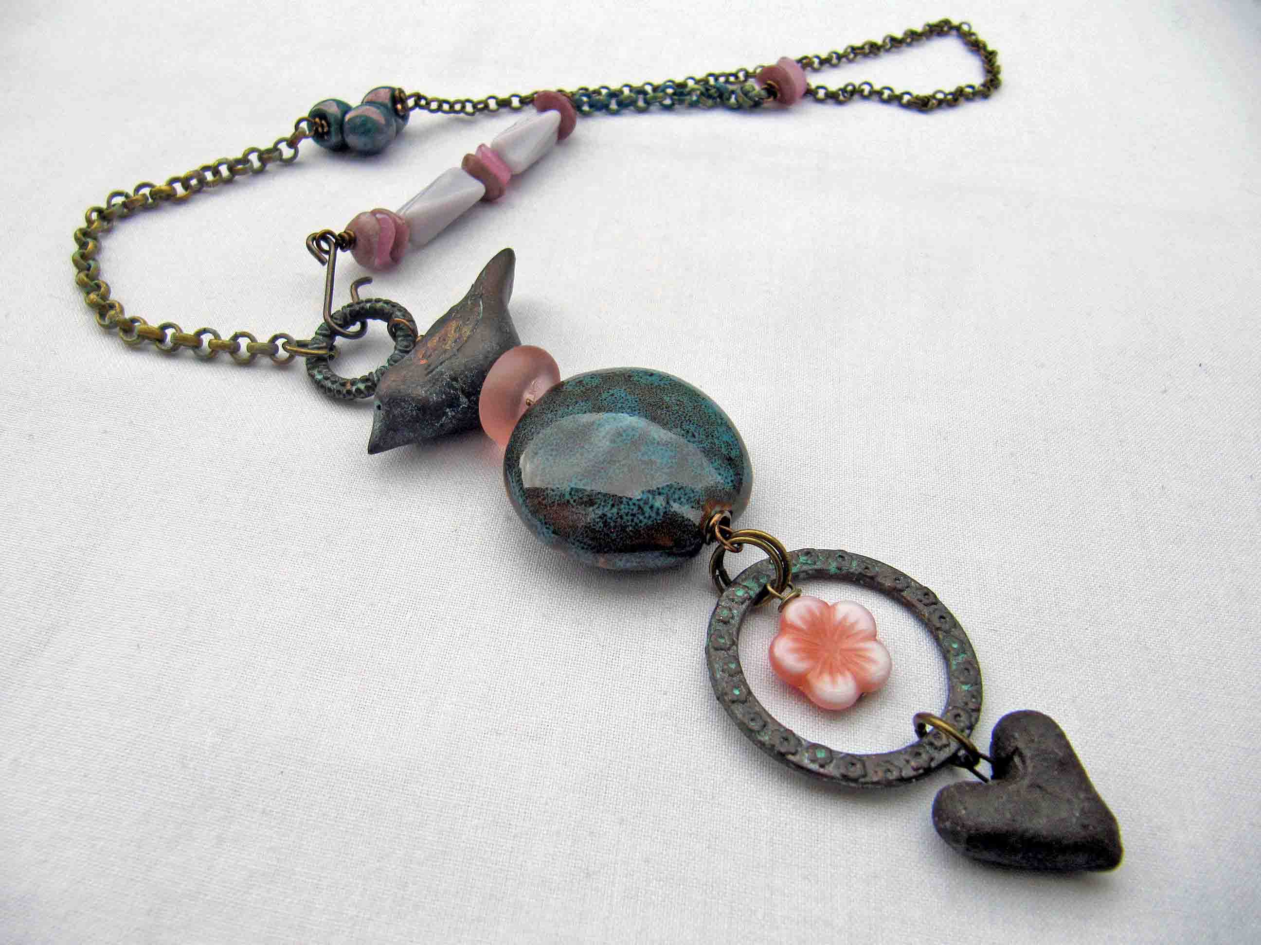
The roses had actually been kiln casualties. I glazed them with one of the most crazy glazes I’ve ever encountered (I hadn’t used it before). Anyway, it broke up in a very strange way, leaving the roses largely a creamy colour but with a subtle marbling of plum, which is a good match for that in Brandi’s palette.

It’s quite a pleasing effect and I might have listed them if they hadn’t also adhered themselves to the wires on which they were hung. Still, I kept hold of them and now I had the perfect use for them. After sitting some dainty dusky pink and white picasso rondelles on top of the roses, I made the wires into connectors. I hung the leaves below them with more czech glass and some little porcelain beads.

Looking at these pieces, I seem to have travelled some way from the inspiration, but that isn’t necessarily a bad thing. So long as the process leads to results with which you are happy, then the inspiration has served its purpose.
Be sure to have a look at what everyone else has come up with:
Tari Sasser - Creative Impressions in Clay